As kids, my sister was blue, while I was pink.
Secretly, I didn’t like pink and always wanted to be red or blue.
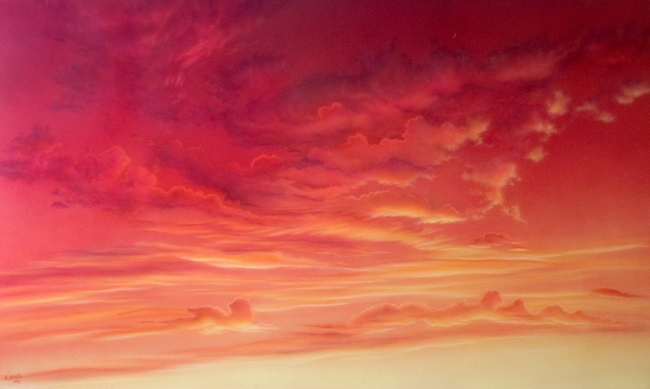
Later on in life I settled for red – then orange – then purple. In fact, my first large-scale sky backdrop (34’ x 120’), painted in 1978 at a film stage in Hollywood, was a vivid sunset in tones of red, orange, and purple.
Curious about the symbolic meaning of color, I researched the topic to find that the passion of red best fit my personality at the time, while blue — associated with words like spirituality, harmony, tranquility, depth, and sky – reflected the aspirations of my inner self. Little did I know then where blue would take me.

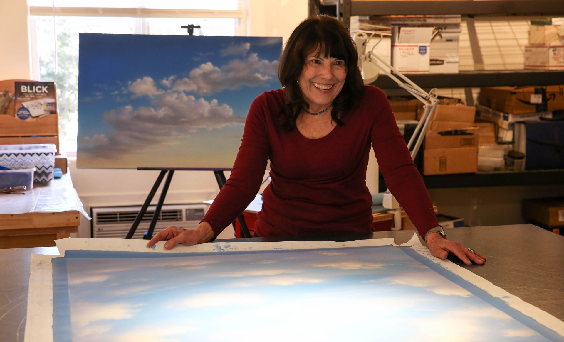
After that first big sunset sky, and over the next ten years, the paintings I made as backdrops on huge sound stages in Hollywood explored all the colors to be found in a sky pallet. It wasn’t until I left Hollywood in 1989 for a new life in the Southwest, and a career as the traveling Sky Lady, that blue began to dominate. For the next 27 years almost all skies were variations of blue, because as a “permanent” sky, everyone wanted the peace of blue. There was happy blue, deep space blue, soft sunset blue, stormy blue, tropical blue, cloudy blue, misty blue, starry night blue, baby blue, and Japan blue.
High above the floor, just under vast ceiling surfaces, spraying variations of blue, I fell into blue. Here at last I found my meditation. Time lost meaning – I was at one with my inner sky, and discovered that it’s blue on blue.
Article written by Karen Kristin, Published in The Free Press.

